Image Format Fundamentals: Compression, Transparency, and Fallback Delivery
Understand the mechanics behind PNG, JPEG, WebP, and AVIF so you can build a reliable image pipeline instead of choosing formats by habit.
On this page
Most image format mistakes happen because the decision starts with the file extension. A better starting point is the image pipeline: where the source comes from, whether it needs transparency, how it will be edited, how it will be delivered, and what fallback the user receives when a browser or app does not support the most efficient format.
This guide explains the mechanics behind PNG, JPEG, WebP, and AVIF. If you need a quick product-style decision table, use the shorter PNG/JPG/WebP/AVIF selection guide. This article goes deeper into compression behavior, alpha channels, responsive delivery, and conversion from SVG.
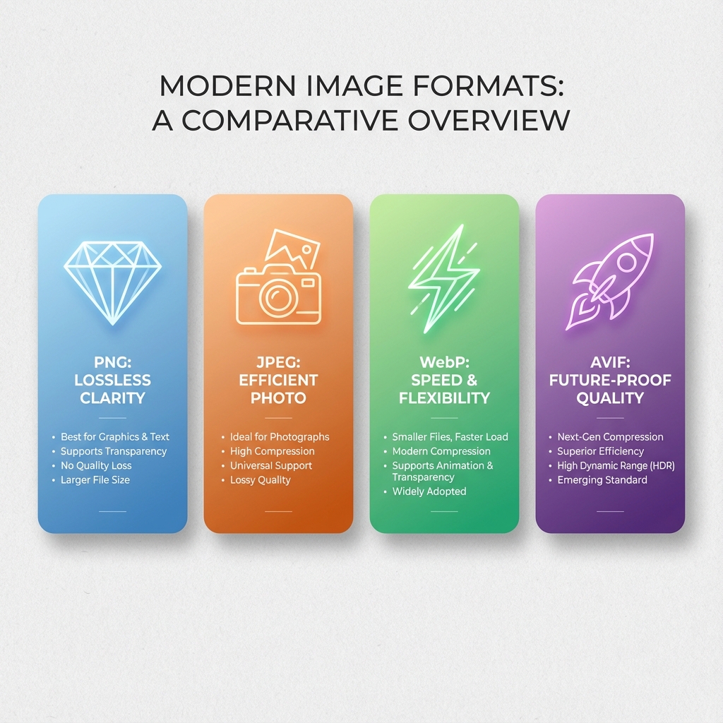
Start With the Pipeline, Not the Extension
Before choosing a format, answer five questions:
- Is the source vector, screenshot, UI artwork, photo, or generated image?
- Does the final image need transparent pixels?
- Will the file be edited again, inserted into a document, or only served on the web?
- Can your site generate more than one output format?
- What is the safe fallback for older browsers, CMS tools, email clients, or desktop apps?
The same image may need more than one format. A logo might remain SVG in the site header, become PNG for a press kit, and become WebP or AVIF only if it is a large decorative raster asset. A product photo may be stored as a high-quality original, served as AVIF/WebP on the web, and exported as JPEG for marketplaces that do not accept modern formats.
Lossless vs Lossy Is the Main Divide
The most important distinction is not "old format" versus "new format." It is lossless versus lossy compression.
Lossless compression keeps pixel values recoverable. PNG is the common web example. It is useful when every edge matters: icons, screenshots, UI captures, diagrams, technical drawings, and text-heavy graphics.
Lossy compression discards information that is usually less visible to the human eye. JPEG, lossy WebP, and lossy AVIF are common examples. They are useful for photos and complex gradients where a smaller file matters more than exact pixel preservation.
The problem appears when the format does not match the content:
| Content | Poor choice | Why it fails | Better direction |
|---|---|---|---|
| Logo with sharp text | JPEG | Edge artifacts and no transparency | SVG or PNG |
| Large product photo | PNG | File size becomes unnecessarily large | AVIF/WebP/JPEG |
| Screenshot with UI text | Low-quality JPEG | Text gets blurry and noisy | PNG or lossless WebP |
| Photo hero image | Unoptimized PNG | Heavy LCP impact | AVIF with WebP/JPEG fallback |
This is also why repeated conversion is risky. JPEG to JPEG to JPEG compounds loss. AVIF to PNG improves compatibility, but it cannot recover detail already lost in the AVIF source.
Transparency Changes the Decision
Transparency is not a small feature. It determines which formats are even eligible.
JPEG does not support alpha transparency. If you convert transparent SVG or PNG artwork to JPEG, the transparent pixels must be flattened onto a background color. That may be correct for a white product card, but it is wrong for an icon that must work on dark and light backgrounds.
PNG, WebP, and AVIF can support transparency, but they are not interchangeable in every workflow:
| Need | PNG | WebP | AVIF |
|---|---|---|---|
| Widest app/document compatibility | Strong | Mixed | Mixed |
| Small transparent web asset | Sometimes large | Good | Often good |
| Precise UI/text edges | Strong | Good if encoded carefully | Depends on settings |
| Transparent handoff file | Strong | Less universal | Less universal |
Watch for matte and fringe problems. If a transparent image was flattened against white before conversion, putting it on a dark background may reveal pale edges. For logos, icons, and badges, keep a clean SVG or transparent PNG master whenever possible.
What Each Format Is Best At
Each raster format has a role in a mature pipeline.
PNG is the dependable compatibility and precision format. Use it for screenshots, UI captures, transparent handoff assets, and graphics with text. Avoid it for large photos unless you need lossless archival output.
JPEG is still the safe baseline for photographs. It is widely accepted by browsers, CMS platforms, email tools, social networks, and document software. It does not support transparency and should not be used for crisp UI artwork.
WebP is a practical modern delivery format. It supports lossy, lossless, transparency, and animation. Browser support is broad, but non-browser workflows can still prefer PNG or JPEG.
AVIF is strong for web performance, especially photos and high-resolution imagery. It can support transparency and higher bit depth, but it benefits from fallbacks and is not always accepted by upload forms, design apps, or document tools. For more AVIF-specific workflow details, see the AVIF format guide.
Use picture for Format Fallbacks
For public web pages, do not force every user into one format. Let the browser choose the best supported version.
For photos:
<picture>
  <source srcset="/images/product.avif" type="image/avif">
  <source srcset="/images/product.webp" type="image/webp">
  <img
    src="/images/product.jpg"
    alt="Walnut desk organizer on a white table"
    width="1200"
    height="800"
    loading="lazy"
  >
</picture>
For transparent graphics:
<picture>
  <source srcset="/images/badge.avif" type="image/avif">
  <source srcset="/images/badge.webp" type="image/webp">
  <img
    src="/images/badge.png"
    alt="Security certification badge"
    width="320"
    height="160"
  >
</picture>
The order matters. Put the most efficient acceptable format first, then fall back to broader support. The browser downloads only one candidate from the chosen branch.
Add Responsive Sizes, Not Just Formats
Format optimization is incomplete if every device receives the same dimensions. A 2400px image served to a 390px mobile viewport wastes bandwidth even if it is AVIF.
Use srcset and sizes when the same image appears at different layout widths:
<picture>
  <source
    type="image/avif"
    srcset="/hero-640.avif 640w, /hero-1280.avif 1280w, /hero-1920.avif 1920w"
    sizes="(max-width: 768px) 100vw, 1200px"
  >
  <source
    type="image/webp"
    srcset="/hero-640.webp 640w, /hero-1280.webp 1280w, /hero-1920.webp 1920w"
    sizes="(max-width: 768px) 100vw, 1200px"
  >
  <img
    src="/hero-1280.jpg"
    srcset="/hero-640.jpg 640w, /hero-1280.jpg 1280w, /hero-1920.jpg 1920w"
    sizes="(max-width: 768px) 100vw, 1200px"
    alt="Illustration workspace with exported image assets"
    width="1280"
    height="720"
  >
</picture>
This prevents a common false optimization: using a modern format while still shipping too many pixels.
SVG Export Needs Special Care
SVG is vector. PNG, JPEG, WebP, and AVIF are raster. When you convert SVG to a raster format, you must choose the output dimensions before the pixels are created.
Good SVG export rules:
- Export icons and logos to PNG when transparency and broad compatibility matter.
- Export at the actual display size, or 2x/3x for high-density screens.
- Use JPEG only when the SVG contains a photo-like scene and transparency is not needed.
- Use WebP or AVIF for web delivery only when you can test fallback behavior.
- Keep the original SVG as the editable source.
For exact conversion rules, the SVG to PNG blurry output guide and batch SVG export specification guide cover dimensions, padding, and transparency in more detail.
Metadata, Color, and Recompression
Image files may include metadata such as camera information, color profiles, copyright fields, and thumbnails. Optimization tools sometimes strip this data to reduce size. That is usually fine for anonymous web graphics, but risky for photography, print handoff, or archival files.
Color handling also matters. If an image looks different after conversion, check whether the source had a color profile and whether the converter preserved or normalized it. Web delivery usually works best when your pipeline produces consistent sRGB output unless you intentionally manage wider color.
Avoid using web-optimized files as your only master copy. A strong pipeline keeps:
- an original or editable source
- a high-quality intermediate when needed
- generated web delivery outputs
- a fallback format for compatibility
A Practical Production Pipeline
A reliable image workflow often looks like this:
- Keep the original source: SVG, design file, RAW photo, or high-quality raster.
- Generate web outputs: AVIF and WebP for modern browsers.
- Generate fallback outputs: JPEG for photos, PNG for transparency.
- Set dimensions,
width,height,alt,loading, and responsivesizes. - Test the rendered page, not only the exported files.
- Keep handoff files separate from web delivery files.
This approach is more work than saving one image once, but it prevents the usual failures: blurry icons, heavy pages, broken transparency, CMS upload rejection, and missing fallbacks.
Final Checklist
Before publishing an image, confirm:
- The format matches the content type.
- Transparency is preserved or intentionally flattened.
- The displayed dimensions are not larger than necessary.
- Modern formats have a safe fallback.
- Text and logos are not saved as low-quality JPEG.
- Web images have
alt,width, andheight. - The original source is still available for future edits.
The best image format is rarely a single extension. It is the output that fits the job: precise enough, small enough, compatible enough, and generated from a source you can still edit later.
Put the guide into practice
Convert SVG files locally in your browser without uploading them.
Open converter